Gamifying traditional hiring assessments
- Company
- Arctic Shores
- Role
- Illustrator to UX designer
- Timeline
- 8 years
- Type
- Game-based assessments
Arctic Shores created game-based assessments that allowed employers to measure how candidates naturally think and behave. I joined as employee number five, hired as a digital illustrator, and worked there for eight years.
Too much like a game, and candidates and clients didn’t take it seriously. Too much like a test, and they switched off.
I drew the artwork, designed the levels with the science team, and over time moved into UX, helping to move the product out of the app store and into the browser as a SaaS product.
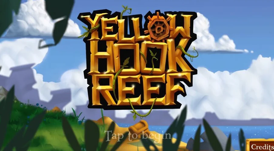
The challenge
Companies often used paper-based tests to measure certain qualities in a candidate. Despite being the norm, they felt dated, few people enjoyed doing them, and on their own they didn’t give an accurate picture of a candidate’s fit.
The mission at Arctic Shores was to turn these dull, unreliable tests into mobile games that candidates wanted to play, that accurately measured their behavioural traits and cognitive abilities, and that reduced test anxiety, stress and hiring bias.
A game that was fun but didn’t measure what it needed to wasn’t useful, and neither was one that measured accurately but added nothing new to the experience.
Designing with the science team
Starting from the science
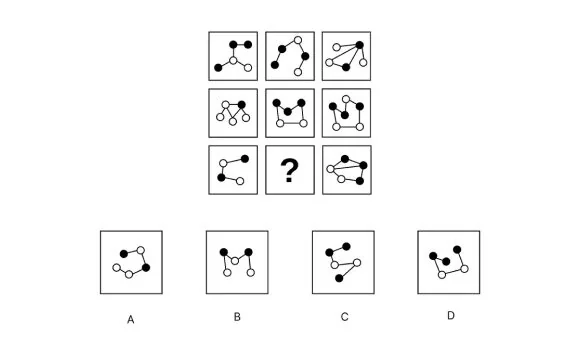
Every game started life as a paper-based test that the science team had researched. They worked out which tasks needed designing, and I worked out how we could gamify them.
There was nothing to copy. It was a new kind of product with no direct competitors, and while brain training games gave us some ideas, they weren’t psychometrically valid, so they were only so useful. I leaned on indirect competitor research instead and worked very closely with the science team. A lot of the time we had to make our best guess, which meant plenty of rework, so we adopted a fail-fast approach: loose sketches, quick notes and short discussions, so we could review ideas with the science team and find out what would and wouldn’t work as quickly as possible.
We were a tiny team and very little was written down, so I also started documenting our process in wikis and walked the wider business through it on company-wide calls.
The goal was to find the threshold for how much a psychometric test can be gamified. We moved the slider back and forth, and the same thing kept happening: the more a test acted like a game, the less reliable it got, and the less seriously candidates took it. But the more it looked like a test, the more candidates found it boring and stressful.
Finding room to play
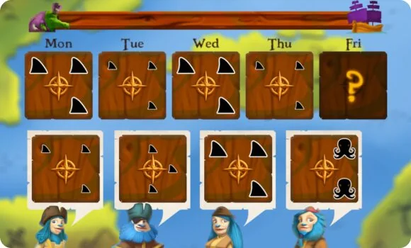
We eventually stopped trying to gamify the core of the test itself, because it made it too unreliable as a measurement tool. Instead, we looked at everything around it: storylines, characters, art style and rewards. None of it changed what was being measured, so we could get more creative with it, see how it landed, learn and iterate.
Fixed by the science
- What’s being measured
- The core task
- Timing and difficulty
- Scoring
Free to design
- Storyline and characters
- Art style and worlds
- Rewards and motivators
- Feedback and pacing between tasks
What the games measured
Employers picked the levels based on what they wanted to measure. Alongside intelligence, the games covered five areas of behaviour:
- Thinking and processing
- Emotions and resilience
- Motivation and drive
- Working with people
- Risk and decision-making
Designing the games
Every asset, by hand
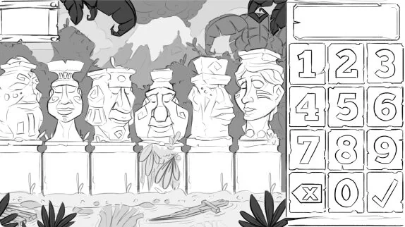
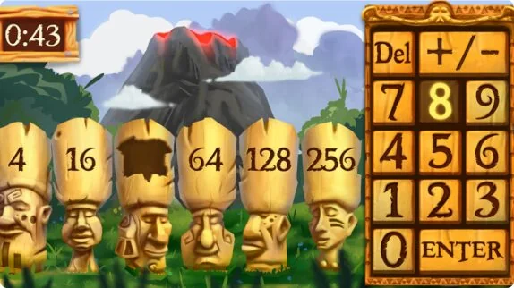
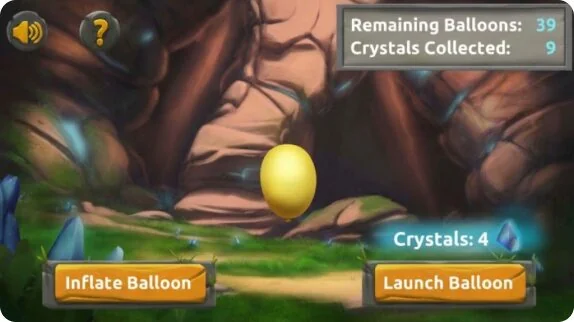
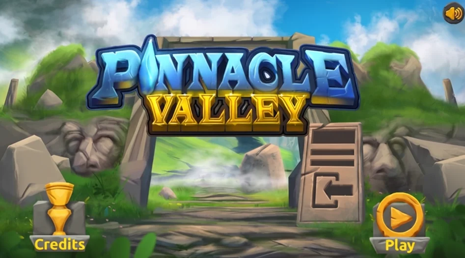
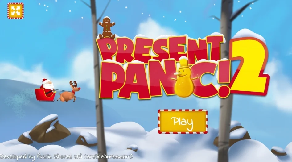
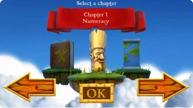
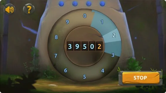
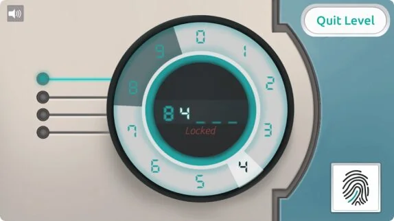
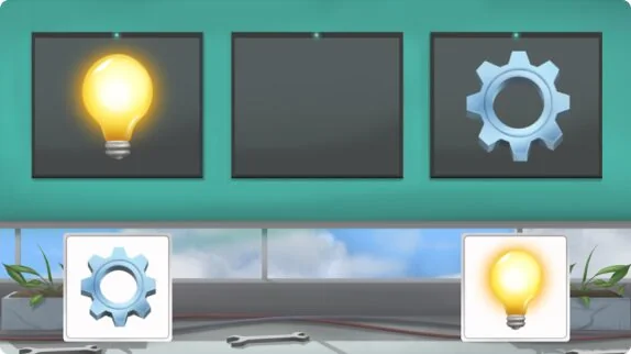
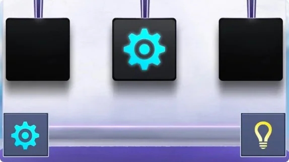
I worked on every visual asset across the games: backgrounds, UI, animated sprites, title screens, loading states, storylines and level designs. Artwork was drawn in Photoshop and built in Unity by the developers, and over time I brought order to the files, with tidy folder structures and properly layered, named PSDs.
Same science, different worlds
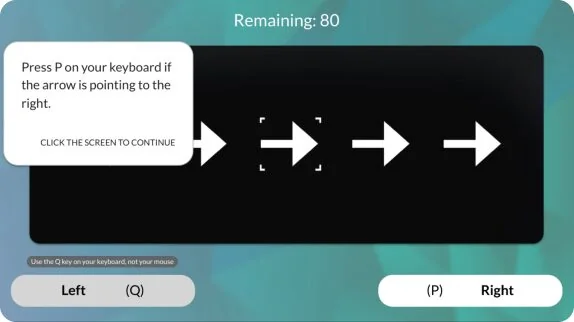
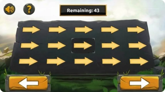
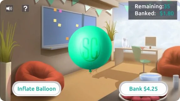
The science was solid from the team’s testing, but client interviews brought up a new problem: different clients had different visual expectations. With the core mechanics proven, I reskinned the games several times, researching companies from the fun and playful to the serious and corporate to shape each art direction. It was a low-stakes way to appeal to different markets, as it needed little developer time and let us cast the widest net. Each version was set in its own world, with its own art style and story, and regular design reviews with the science team made sure the science underneath never changed.
More from the games
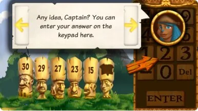
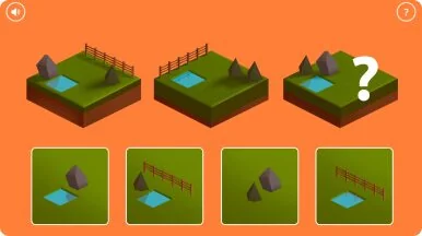
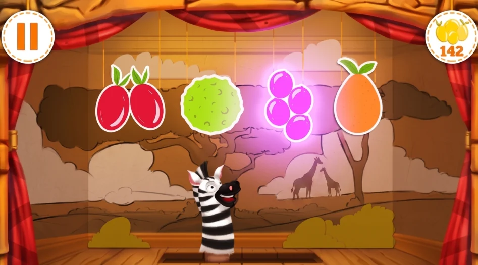
Into the browser
A link instead of an app
Taking an assessment used to be a bit of a chore. Candidates waited for a lengthy email from the employer, downloaded an app, then logged in with a unique key. Towards the end of my time there, we rebuilt the whole thing for the web as a SaaS product. From then on, candidates just clicked a link and played in their browser.
Before: the app
- Email from employer
- Download the app
- Log in with a key
- Play
After: the browser
- Link from the employer
- Play in the browser
Branding at scale
Clients kept asking for the games to look like their own brand, but every asset was hand-painted in Photoshop, so nothing was set up to be rebranded. As a middle ground, I wrote a document mapping where colours could change and logos could sit, which became the template for every custom version.
To speed things up, I restructured the layers in each file so the brandable areas were quick to change. Shading sat on neutral-toned Multiply layers and highlights on Screen layers, so they worked over whatever brand colour went underneath. Most of the time, anyway: some colours still needed adjusting by hand. It was better, but it stayed a manual process.
Moving to the browser brought the opportunity to change that. Photoshop was gone and Figma became our main tool. I redrew the illustrations as SVGs and built component libraries for the UI and game assets, so all the artwork and UI was vector: scalable, quicker to work with and more consistent. Colours and logos became values to swap rather than artwork to repaint, and rebrands that used to take a lot of hands-on work could be turned around much more quickly.
The last step took me out of the process altogether. We built a branding tool into the assessment so clients could recolour the UI and illustrations and add their logo themselves.
The hard part was keeping it accessible. Rather than limit clients to a fixed set of swatches we knew would pass WCAG, the tool worked with the colours they picked: text and icons flipped between light and dark to keep their contrast, colours that failed were nudged lighter or darker while keeping their hue, and critical in-game elements, answer states and focus stayed fixed.
What the branding tool did with a client’s colour
- Client picks any colourNo fixed swatches
- Text and icons flip light or darkTo keep their contrast
- Failing colours nudgedLighter or darker, same hue
Never changed by the client
- Critical in-game elements
- Answer states
- Focus
The platform
As the product grew into a SaaS platform, my work shifted more towards UX. Employers needed to set up an assessment, pick the traits that mattered for the role, send it out to hundreds of candidates and keep track of who’d finished, so they could find the right people faster.
Onboarding for both sides
I designed the onboarding flows and screens for both clients and candidates, building each one around user personas to reflect who would be using it. For clients, the flow focused on getting them set up and sending out their first assessment. For candidates, the aim was to try and take the anxiety out of starting. The flow set expectations up front, telling them how long it would take and that there were no right or wrong answers, then let them practise certain levels before it assessed them.
- How long it takes
- No right or wrong answers
- Practice levels
- The assessed levels
A clearer experience
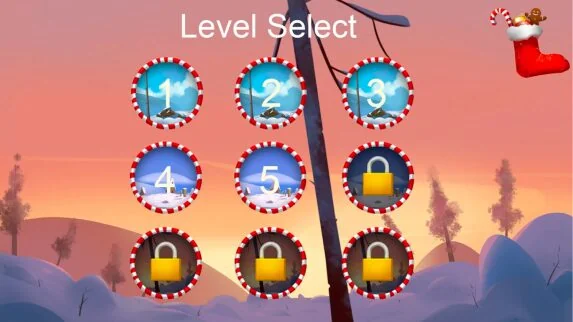
In the older assessments, candidates had no idea how far through the assessment they were, and it caused a lot of support requests and added to their anxiety. So I designed a level selection and progress screen, showing how far they’d come and what levels were still to go. When they’d finished, they’d also get a personalised report on their traits. That way the assessment gave them something back, instead of their results disappearing into a hiring process.
3 of 6 levels complete
- Level 1Done
- Level 2Done
- Level 3Done
- Level 4Up next
- Level 5To go
- Level 6To go
The outcome
I illustrated and designed six gamified assessments, reskinned them into different worlds for different markets, helped rebuild them for the browser, and grew from illustrator into UX designer as the product became a full platform.
Company-wide results, which my work fed into:
- More than 3 million candidates assessed, with clients in over 40 countries
- Used by more than 100 employers by 2020
- 91% of candidates enjoyed the assessment, in one published client case study
- Another client doubled the number of women reaching final interview stages
Looking back
Despite the numbers above, I often wondered how much the games were really helping candidates. Were we actually reducing the stress of applying? Plenty of candidates told us they found it frustrating that it felt so much like a game. “Why am I playing a game to get a job?” came up again and again, and many, though not all, struggled to trust it.
We tried a lot to close that gap: different art styles and storylines, more abstract and test-like versions, and clearer onboarding at every touchpoint, from the invite email to the start, middle and end of the game. But we could only explain so much, because the company was very protective of how the assessments worked behind the scenes. I don’t think we ever fully solved it. However well it’s designed, playing a game to land what might be your dream job is always going to come with some stress.
Designing for the science, the candidates and the employers all at once meant a lot of trade-offs, and plenty of game ideas didn’t make it because testing showed they made the assessment less reliable. That was frustrating at times, but accepting it and putting the creativity into the world around the test is what made it work.
The biggest thing I learned was how much good work can come out of tight constraints. Working within the science forced me to learn how to squeeze out the creativity everywhere else.